Brand design taking a community to new heights - Hawkhill Community Association
BACKGROUND & PROBLEM
Hawkhill Community Association is an organisation that serves local residents by providing vital services including youth engagement, a community shop, recreational spaces, and educational programmes. Situated in one of the most deprived areas in Scotland, as identified by the SIMD 2020 Overall Deprivation Map of Scotland, the association and its centre play a crucial role in uplifting a community facing significant social and economic challenges. What they do matters.
To support the delivery of centre services and business goals, the charity required a fresh and engaging brand identity with messaging that clearly reflected its values and intended impact. Without a consistent brand, the centre was missing opportunities to connect authentically with its audience and enhance its visibility as it progressed with its strategic goals and future initiatives.
CONTEXT AND KEY CHALLENGES
With its deep-rooted impact, the centre needed an updated and cohesive brand identity that resonated with its audience. Its visual presence was fragmented, and there was no clear messaging to communicate its values or mission. This made it difficult to build recognition and engagement. No brand guidelines were documented, meaning any future design work or collaboration risked compounding the problem.
The centre needed a brand that reflected its focus on growth, community support, and grassroots energy, and for this to be documented for consistent delivery.
Key challenges included:
No existing brand guidelines or visual identity
Inconsistent use of logos, colours, and messaging
A need to unify internal and external communications across a wide range of projects and initiatives
GOALS & SUCCESS METRICS
The branding project aimed to:
Develop a new logo, colour palette, visual identity, and brand tone of voice
Establish a brand stagey and positioning that showcases the work already achieved by the center and resonates with both the local community and external stakeholders
Document brand guidelines for consistent use across platforms and partners
Success was measured by:
Positive feedback from staff, volunteers, and community members
Adoption of the brand across all materials and platforms
Improved clarity in communications and promotional efforts
Time saved when collaborating and creating designed materials
OUTCOMES
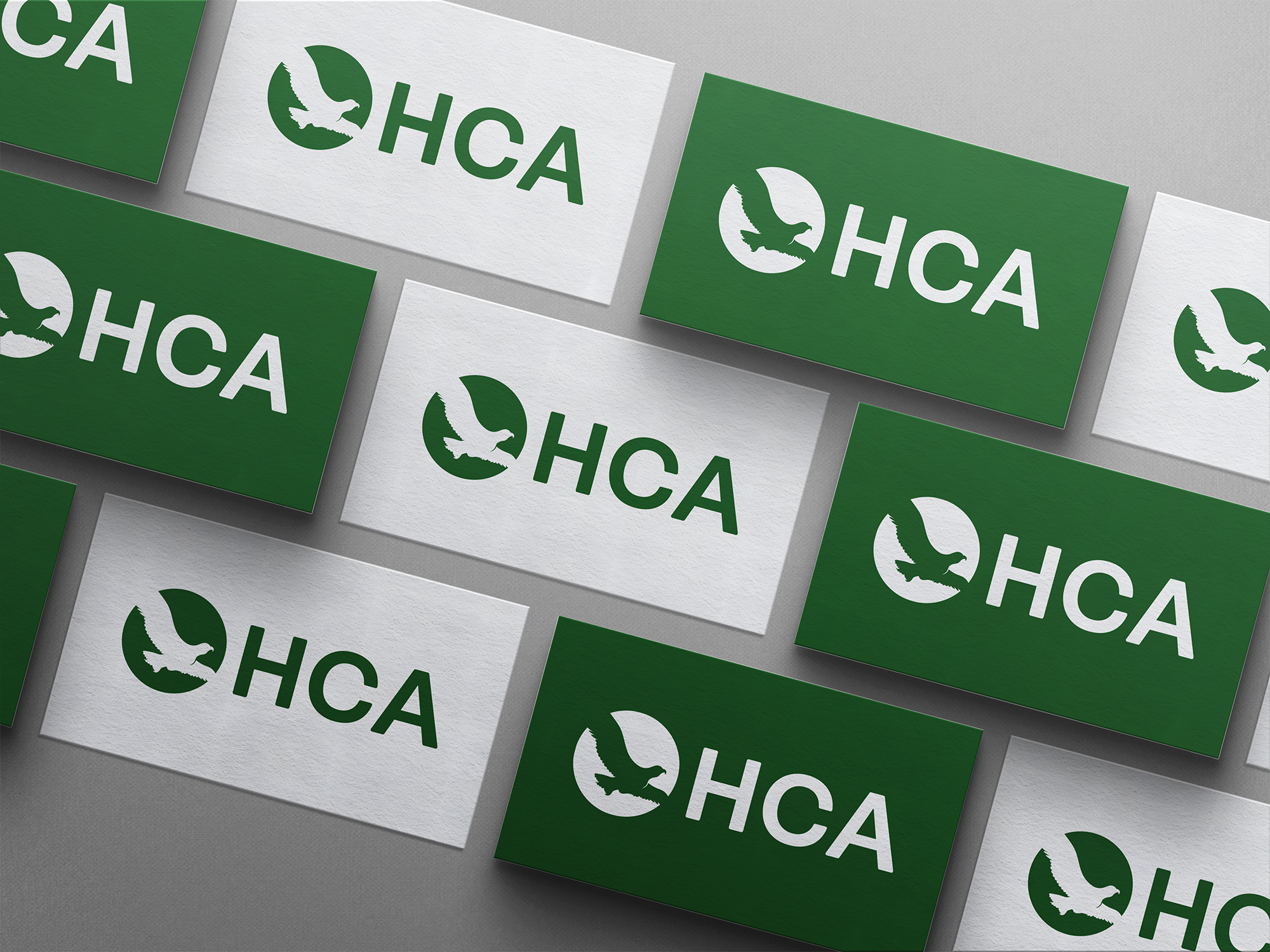
The new brand identity brought Hawkhill’s values to life, with the logo and strapline “empowering growth, giving communities wings”” capturing the center’s ethos of supporting its community to reach new heights. The colour scheme was chosen to reflect the community’s grassroots and organic nature, using tones that represent both the ground and the sky. The brand guidelines ensure ongoing consistency across all touchpoints, and the association’s staff and volunteers embraced the refreshed look. This has already been put to use in the associations volunteer recruitment campaign.
The revitalised brand empowered Hawkhill to build on its already strong connections with the community, present a professional image to funders and partners, develop materials to recruit volunteers, equip staff with tools to communicate more effectively, and reinforce its identity as a welcoming, inclusive space.
“Doug was absolutely brilliant! ... refreshing our branding, and crafting a fantastic new logo, strapline and approach. We’re delighted with the results.”
SANDRA FORSYTH
DEVELOPMENT MANAGER, HAWKHILL COMMUNITY ASSOCIATION
Let’s work together
Get in touch to find out how Studio Gu Bràth can help tell your story through brand design, graphic design, web design and marketing strategy.